Wednesday 20 April 2011

Questionnarie Results

After showing the video to a number of people we gave them a questionnaire. And have number of really nice comments about it!! Here are some of the summarized results.

FEMALES (6 in number)
Age: 16-20
Average Rating 8.5/10
About all of them were able to recognise the genre of the movie. They really liked Misc-en-scene and Sound effects. And the two of them said that they really liked the way the trailer is edited.
One of the good response is as follows;
''It's nice to see how you have manipulated the basement of school to create the eeriest effect. I loved the way you have created the logo of the company 'the opening eye'. And yes i  really appreciate the way you have created the sound effects''

MALES (9 in number)
Age: 16-21
Average Rating 9/10
They all identified the genre correct and liked Misc-en-scene , sound effects and editing. They all wanted to see the rest of the movie.

One of the nice response is;
'' Really nice piece of work, i want to see the rest of the movie. Really nice way to manipulate the location and  good sound effects. This is appreciable that you haven't used any sounds from outside the footage''

Posted By Zayan

Questionnarie


Age:
Gender:
Please list your 3 favourite films:
 1.
 2.
 3.

What is your favourite genre of film? Did the sequence make sense? YES / NO If ‘No’ what didn’t make sense? Why?

What was the title of this film?


Which genre would you classify this film as?

Comedy                     Horror                           Thriller                 Rom-com                              Action                        Adventure                     Sci-Fi
What did you like about the film?

Music               Character                Title          Plot                 Location
Other (Please specify) __________________________

Does it remind you of any other films you have watched?


What do you think we can improve on?


Would you be interested in watching the rest of this film? YES / NO Please specify your

Reason:


On a scale of 1 to 10, how would you rate the sequence? (Please circle):
1        2         3         4         5        6         7          8           9             10

Posted and Made By Zayan

Evaluation Video


This is our Evaluation Video. It was shot at Hassan's place and Yes! It was fun. And it was edited by Zayan.
* Sorry for the dialect and the 'A...aah....a' breaking in the middle =p
Posted By Zayan

Evaluation Questions

Q.4 What have you learned from the audience feedback?

'If a product doesn't have any audience, there is no need to produce it', by keeping this line in our minds we began our Advance Portfolio. There is no audience but people with varying tastes. So we were keen on producing text siutable for varying tastes. In our research we were able to find out that the most active audience i.e. teens and above like horor genre alot. And movies like 'Blair Witch Project' and 'Paranormal Activity 1 and 2' had low budget but were able to pull off a great deal of business. When we selected that we will be doing horror movie, we told about this to our fellows in class and took their responses that they really like to see a horror movie with sub genre as paranormal.

When we were done with our first cuts, we showed them to our fellow students and got their responses which lead us to change the name of the movie as VENGEANCE and adding more sound effects Laterwhen we showed our final product to our audience they really appreciated the following:
  • The use of logo in the Trailer.
  • Sound Effects and misc en scene
  • The use of location image as main image instead of a character image- they really saw it as a 'trend changer'

Posted By Zayan

Evaluation Questions

Q.3How did you use media technologies in the construction and research, planning and evaluation stages?

As Zayan took video portfolio in his Foundation task G321 therefore he had a grip on editing software like Adobe Premiere 7.0. In start of G321 Zayan saw Adobe tutorials on Youtube. And also our media tutor helped him in learning some of the features of Adobe.

Starting with the editing process of G324 Zayan was certain that this time he had to show better skills of the software. So he put the effects on the video to give it a darker shade. This time he also
1. Manipulated the logo as he wanted it to appear.
2. Changed and added effects on SOUND for the first time to get a better sound.
3. Worked with more cuts and cross dissolve at different places to make text understandable.

I knew how to use Adobe Photoshop for image manipulation. I and Saud were more interested in doing the ancillary tasks so we were responsible for their production. But when ever we held group meetings we would discuss how can we use different effects of Adobe Photoshop to create the image we wanted to create. There I chose to create a Poster and Saud Magazine. I had good practice on Adobe Photoshop as I had taken Print portfolio in my Foundation.

We spend a lot time in research process by using web 2.0. We searched Google and of this genre and found any references. Then by working on those references we were able to work out what we wanted to do. We used websites like ‘facebook’ to see how many likes a certain movie got so we were able to note down the popular movies between the audiences.

In our planning, we used Microsoft word to note down main events we will go through till the end of the journey. We made a list of things we needed to do before completion. We used Microsoft paint to make a shoot log and finally we used BLOGGER to upload all our work we did so far to make us more organized.

In evaluation stages, we used projector to show our products to audience in our class and then distributed questionnaire. Then we analyzed what we got from them in a form of a paragraph, to be shown on the BLOGGER.

Posted By Hassan

Evaluation Questions


Q.2 In what ways does your media product use, develop or challenge forms and conventions of real media product?

My media product is a teaser trailer of a horror movie. In horror genre a great deal of suspense is kept and enigma plays a vital role. For my teaser trailer I analyzed two trailers, one of the Blair Witch Project and other of The Silence of the Lambs. Also Hassan analyzed trailers of Paranormal Activity 1 and 2. And after analyzing we noticed some very similarities in then, some of then are listed below:


  • A great deal of suspense in kept and the ‘trouble maker’ is not shown.
  • Texts are added to the sequence to convey some what of information.
  • They all followed some what of Tendorov’s narrative theory of equilibrium; on at the end equilibrium is not re-established.
  • A fast pace editing.
  • Creepy sound effects.
  • Deaths of characters.
  • Misc- en scene is kept dark i.e. location are scary and contain dark elements e.g. Forests and Basements. Daylight is not shown.
  • Hand held and surveillance camera recordings (instead of The Silence of the Lambs)


So while we were deciding the location and props we kept in our minds these all factors to establish verisimilitude. Even when I was editing the trailer In kept in my mind how would I use the sound effects to elaborate the conditions of the characters as did in the real media products. And I use fast pace editing to create tension in my audience.

So, basically in my media product I used and developed the form and conventions of Horror genre to make my product understandable to our audience.

In the ancillary texts, in our case poster and magazine, we decided to challenge the forms by not taking a solo picture for editing. Instead we used shots of locations and used blood effects to make them scary. In magazine cover, we showed an eye to disturb the audience. The magazine follows a typical way in which a horror movie is shown but in our case we challenged them by creating an image of location instead of a character.

Poster was indeed the most rebellious of all. The use of a location image as main shot and using more creative and gory effects Hassan was able to pull off a great poster. It had all elements of a poster i.e. told about Characters and even had a tag line but we were greatly appreciated by our fellows on how we broke the ‘boring; routine of character image manipulation.

Posted By Zayan


Tuesday 19 April 2011

Final Poster.


This is the final design for the poster. After deciding it ina group we all agreed the name of the characters and some improvisations were needed to give it a more poster like look. We were all very proud of it.

Posted By Hassan

First Draft Of Poster.


This is the first ever attempt at the poster. I wanted to break away from the conventional Villian/Hero image on the front and try out something different. So I used a very angled shot that we took during the shooting and utilized it to produce the poster for our movie. After changing the brightness and contrast level, I edited it so that it looks like a horror movie poster. I used the biggest convention, which was blood and dark ghostly shape in the background to give it a dark, eerie feeling. However, it still feels incomplete and we are going to decide in the next group meeting that how it can be made better than it already is.

Posted By Hassan

Evaluation Questions.

1. How effective is the combination of your main product and Ancillary texts?

The main product is teaser trailer of a horror movie. The ancillary texts include a magazine front cover and Poster. While making these things,we kept in our mind that they must relate to each other. So we kept a lot of similarities :

1.The logo was a uniting element connoting that all of these are made by a main production company-MADEYE.

2.The  micro elements of all the texts relate that the genre is HORROR

3.The image manipulated in poster and magazine is about the same, showing lockers at school. Same showed in the video.

4. The font of the title of the movie is same throughout and so is the 'tag-line'.

So these points really show how our product is united as one to enhance the effectiveness of it.

Posted by Saud

POSTER


The Trailer.

This is it... The final version of the trailer, VENGEANCE.
There are no prominent changes from the original- just a better version. I have now perfected sound to my level best. Yes! There are some quality losses due to .avi to .flv convert.
Posted By Zayan

Magazine Finally Made.

Here it is the final copy of magazine. There have been changes in title and layout, because it was decided so in the group meeting
 
Posted By Saud

Textual Analysis Of Poster # 2.


This was a more conventional horror poster. Almost all the horror movie posters I came across featured a heavily manipulated image of mostly the villian or a supernatural entity. This poster is no different, the main photo on the poster is a very edited and manipulated image of a female. By the use of image editing softwares it is edited to be a very scary supernatural entity. However, upon closer inspection we find that it is not simply a heavily edited picture, it also contains photographs of a couple around the face area of the girl. It goes perfectly with the tag line "THE MOST TERRIFYING IMAGES ARE THE ONES THAT ARE REAL". With the help of these clues the audience can deduce that the horror movie has to do something with photographs and thus it captures their attention.

Upon closer inspection of the edited image I was able to figure out that it was not something out of the world. The picture was smeared and the right side of the face shows the skeleton of the girl while the left side of the face shows her burned and blurred out skin. Maybe this was one of the hints for the storyline of the movie, that the supernatural entity is actually a victim and the movie is about how she became this deformed creature.

Posted By Hassan

Textual Analysis Of Poster # 1.


This is the main poster for the movie "Paranormal Activity". After quickly analysing it one time, I felt as if the poster lacked some detail and it really disappointed me, however after going through it again slowly this time, I realized how simply and without the use of conventional factors used in posters for other horror movie's, the designer has gotten his message through.

The image used is a screen shot from the movie and has been given a grainy effect to further prove that it is been taken inside the movie from a amateur camera.The couple are relate-able characters and audience is expected to relate to them and wonder the reason for their anxiety and share it. The next thing is the door in the poster. The fact that the couple are looking at it with a tensed expression on their face and it's open while both of them are sitting on the bed is further expected to scare the audience and re-affirm the belief that "something is out there", which goes with the whole Paranormal theme in the movie.

However, the poster does not contain any conventional factors from other horror movie posters such as blood, the colour red, the picture of a villain or hero, and in some rare cases only an empty location. However, it does feature spine chilling tag lines and a reviewer feedback on the top which makes the poster more appealing. Tag lines such as "WHAT HAPPENS WHEN YOU SLEEP?" and "DON"T WATCH IT ALONE" makes the poster more interesting as it captures the audiences attention and makes them want to watch the movie.

The poster is neatly edited and layout is mainly centre aligned, so it looks neat, minimalistic, and your eye is drawn down the poster.

Posted By Hassan

Sunday 17 April 2011

My First Attempt

This is my first attempt, i have given it a shape i wanted. Now i want some remarks from my group fellows and our media tutor. It is an avi to flv convert so have a great level of clearity loss. The whole thing is done by Zayan

Posted By Zayan

Editing Sound

I personally believe that sound plays a lot bigger part in horror movies than any scenes. So I am really cautious how I want to manipulate the voices and sounds?

When I was making notes I listed one point I want to share now, ‘Some random sounds, captured unintentionally, I think that by changing their speed and duration I can create some freaky effect’. But when I really did that I was amazed how duration can create the eeriest effect you want it to!! The example can be of the cream of Saud which i used more than twice and every time i just changed its duration and added some effect.


And i DID NOT use any other SOUND from outside the footage i got.

Posted By Zayan

Manipulation of Logo

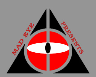
The main and original logo of the company is as shown.
 

But when I put it in my video, it didn’t bring out the meaning Mad eye. Yes! The red circle in the centre is supposed to mean a mad eye but I showed it to many people an they didn’t get the idea right. So I had to be a more creative on this and thus I used the ‘F9’ button on Adobe Premiere to open a talops window and added the words mad eye and the white oval in the centre. Then I again showed my logo to my friends they thought, ‘It doesn’t scare you’.
So once again I redid my thing but this time I added a dissolve so the eye appears that it is being opened and guess what my audience loved it.
Posted By Zayan
My Editing Idea.


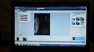
When I got the whole footage on my USB, I went home and went through all of it. I saw it twice and each time made notes on how I would manipulate a certain shot. I then brought the complete footage on Adobe Premiere, made an .avi and then exported a movie. And again I made a new project and worked my way.

My idea is to create disturbance in my audience, giving them the least of information I could. When I a scary/horror movie you see the ghost you are not any more as scared as before because the thriller is over. So I wanted to show the activities of the ‘angered spirit’ in the school. The very to begin with a boy being pulled in a room, people running and last but not the least some blood.

It is not all about putting the random shots and making a teaser but those shots must tell some story. Most of all to get my audience engage with the three characters. Firstly, I will be putting up some of the shots where my three characters are shown doing random stuff in school. For example, what would one do when they break into a school? Yeah! That’s the type of things I wanted to show so that I could create verisimilitude. Then a talops saying that, ‘the fun and games have ended’- that is where the fun begins. Then the complete disturbing shots are sequenced till the end where the name of the movie appears.

The name of movie is still under considerations, many of the suggestions have come up but the group really likes the name VENGENCE. As we have showed the thing called an angered spirit.

Posted By Zayan

Task Division

Zayan Nadeem is going to edit the teaser trailer.

Saud Zafar is going to make the front of the magazine.

Muhammad Hassan is going to make the poster.


Posted By Zayan.

Saturday 16 April 2011

Shooting at the Campus.

These first shots were taken from the basement, where we are showing how the 'spirit' dragged the character inside. And then the last shot where we show another character being 'possessed' by the spirit. Hassan was the stunt man, Saud in frame and Zayan handled this shot.


 These are the three pictures which justify our hard work that how we closed a major source of light. It was in fact the hardest and the most time consuming task of the day!! Zayan  was there with us, telling us what shots to take. We had with us the storyboard made by Zayan. The props and video camera were provided by Hassan.The blood idea was given by Hassan and it was very very inspiring and thus enabled us to create verisimilitude.
We three stayed till like 18 00, in school. The school was getting creepier by minute. We did this thing late because we wanted some blue and black color in the background.Also here in Pakistan it's yellow and sunny all the year. There were three locations in all. The school basement, corridors and the first floor lobby. First we did our shooting in the basement and then to the other two places. We were still welcoming new ideas at the spot because the location appeared quite different from what we expected. So we did basically change some of the shots because the new appeared quite better than planned.The experience was exciting , we manipulated the location and used simplest props to create the eeriest effect we could. Here are some of the proof shots we took, but mostly Saud as he was responsible for this along with Hassan.

Posted By  Saud.

Friday 15 April 2011

Story Board


This is the trailer's storyboard which was made by Zayan. He made it because he is going to do the video editing all by himself. Saud is going to shoot the video with Hassan assisting him.  We are not do the whole thing strictly as shown in storyboard, if we feel some changes during our shooting we will surely take them into consideration.

Posted By The Group

Thursday 14 April 2011

Shoot Log

This is our Shoot Log. Made in Microsoft Paint.

Posted By Hassan & Created By Zayan

Final Logo Design

After trying out many different colour combinations and styles we finally settled with this logo. The colour was what forced us to choose this style of logo, because of it we were able to easily incorporate it with the Poster and video without issues.


Posted & Created By Hassan

Tuesday 12 April 2011

Rejected Logo Designs

A very simple yet inspiring logo for our production house. We decided to name it "Mad Eye Productions" for a unique and different look. The problem with this logo was that the text inside the eye "Mad Eye" was not readable when used in Poster and Video.


This Logo which was rejected was done on basis of being "grand" and hard to place on poster and especially video. It carried too much detail so we had to scrap this idea.


Posted & Created By Hassan

Friday 1 April 2011

Front Cover of Horror Magazine


Posted By  Saud

Making of the Horror Magazine

Following are the steps that i took for the construction of our Horror Magazine.


Posted By  Saud

Analysis of Horror magazine Front Covers
 I selected two horror magazine covers from my research and carried out an analysis on them.... 


Above is a front cover of a horror magazine. It has a medium close-up of a fearful wolf which represents the 'wolf man' , as mentioned by the subtitles on the right side of the front cover. The main title is 'scream' is in bold letters and is red in color, which is quite in contrast with the theme represented by the main picture of the cover. The magazine is simply designed with a little text. The colors used for the text are red and white which is also blending perfectly with the greish black background. The subtitles are arranged on the lower right side of the cover in a way that the image of the wolf is not blocked by the text and this gives the effect of openness to the magazine.


The horror magazine above represents a horror phenomena, which can be seen by the scary image of the main character on the cover. The image is a mid-shot of a man who is covered in blood. The background of the magazine uses the colors red and white, with a portion of black. The font used for the text is in bold and white color with a red edging which perfectly blends with the background of the cover. 'SCARS' is the main title iof the magazine which is quite conventional to the magazine because it is in contrast with the the man covered in blood. Furthermore the subtitle's are arranged in one line and on the left corner of the magazine allowing the image of the man to be clearly visible.It also features certain horror movies such as 'Hatches' and 'sex and the 70's vampire'(seen on the sub titles).


Posted By  Saud
Research on existing Horror Magazines


Posted By  Saud